This is for other Ghostbusters Props that don't fit into the categories above.
By gbfhs
#4790761
Hi to everybody, First post.
I joined the forum because for some strange reason i have decided to make a 2ft x 2ft GB1 firehouse sign and i found some good images and references on this site. I know this has already been done but i thought i can so i will. If people are interested in the build i will post pics and progress updates, Thanks
Last edited by gbfhs on August 14th, 2014, 2:29 pm, edited 2 times in total.
Alex Newborn liked this
By Alex Newborn
#4790814
gbfhs wrote: i thought i can so i will.
That's a great can-do attitude. I look forward to seeing whatever you create.

Alex
By gbfhs
#4790902
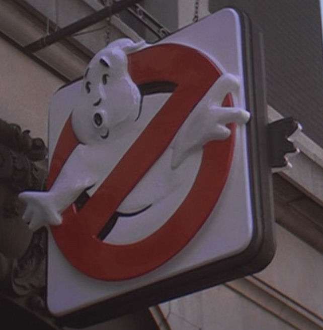
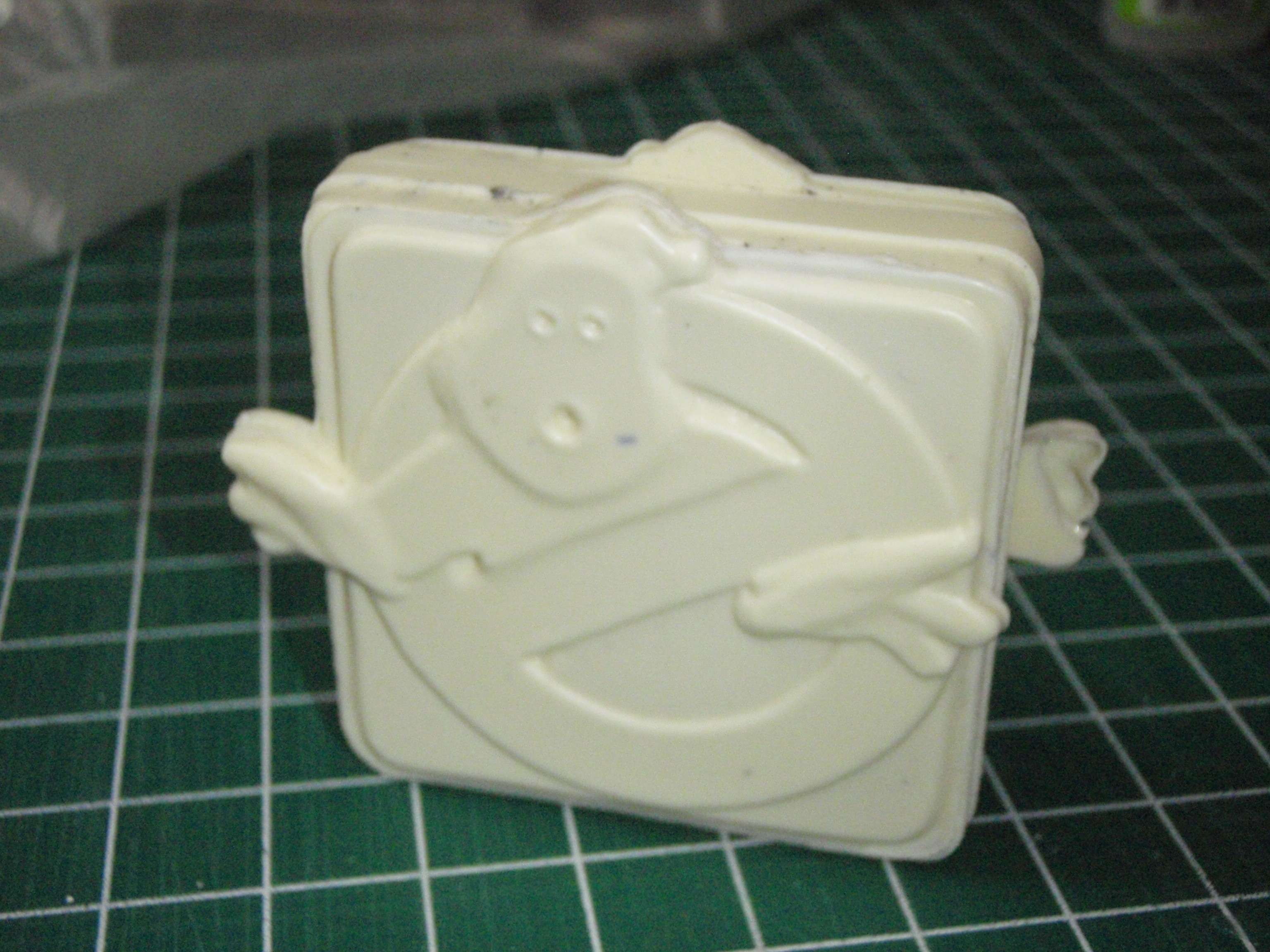
Thanks Alex. What i intend to do is, make a plug to vacform over. I have already started to make this, Basically What i have done upto now is cut a square out of mdf and rounded the corners with a router. This will be my base. Next i have used the router and a plate to cut the circle. Next i cut out the basic shape of the ghost and the used car body filler to give it a more 3 dimensional effect.
I have a couple of photos that i will try and upload soon. This is still very much work in progress, so any help or suggestions are very welcome. Oh on a side note, when i began i started to base it on images from the logo, but when i found this site and i found the screen shots of the original sign i realised its totally different, or is it just me becoming ghostbusterfied.
By Alex Newborn
#4790908
You're right, the three-dimensional lighted sign in the movie doesn't resemble its flat counterpart logo very much.

But it always helps to check a bunch of reference material during the creative process. My memory is notoriously bad on small details, then when I go check the source material, I realize I was way off.

Actually, I posted a photo online a few hours ago where I posed two Mattel figures to re-create a moment from the "Vinz Clortho" colander scene of the movie. I was convinced when gathering the toys that Egon was in his white lab coat, so I snagged the one I custom painted a couple years back.

But when I checked the movie, he's in a more greyish labcoat, so I used the regular Mattel blue labcoat figure when I actually took the pic.

Ironically enough, one of the first comments anyone made was "Egon's in a white labcoat in that scene".

I guess sometimes even our collective memories of the visual details can be faulty. So always check the original source when you can.

Alex
User avatar
By Kingpin
#4790921
The sign looks more like the logo than the logo in the opening titles. Admittedly with it being 3D, things will look "off" because of the way it's been shaped, but I bet if we'd been able to see it face-on it'd look pretty much spot-on.
By gbfhs
#4791003
Hi to everyone, I have got a few pics on the progress of the sign but i am not allowed to post attachments. Can anyone advise me on what i need to do. Thanks
User avatar
By CaptCyan
#4791010
gbfhs wrote:Hi to everyone, I have got a few pics on the progress of the sign but i am not allowed to post attachments. Can anyone advise me on what i need to do. Thanks
Hey gbfhs!

Pretty easy stuff really.

Pick an image hosting site like Photobucket or ImageShack, most have free uploads sections. Join, follow instructions and upload your pictures. The image site will assign URL's to each picture for different use. Copy the URL that makes the picture show up on message boards and paste it into the post where you wish the picture to show up.

You can check your post to see if it is the correct URL by hitting the PREVIEW button. If the picture doesn't show, it's not the correct URL so try another, then adjust it to your liking before hitting SUBMIT.

There, that ought to do it.
By gbfhs
#4791021
Thanks to CaptCyan.
Here are a few pics as promised. This is not the finished peice, this is just to gauge any thoughts comments and improvements. I know the eyes etc are wrong this is just for my reference. But please feel free to comment and help me make this one of the best signs to date !!!!! All comments are welcomed, good or bad. Please have a input, because toghether i believe we can make something accurate and special.
Image
Image
Image
Image
Image
Image
User avatar
By CaptCyan
#4791038
That's pretty damn skippy.

His right hand seems a bit thick and from you pics it appears you still have to raise his lips, nose and eyebrows, otherwise it looks good to go.


Image
By gbfhs
#4791052
Thanks for your comments / suggestions. I totally agree the right hand is a wierd shape, i think this is because i modelled it on the logo rather than the actual sign. I was trying to decide which one to go for and i ended up with a bit of both, but now i am going to try and get it as screen accurate as i can.
By gbfhs
#4791150
Couldn't help myself, I just seen so many things that could be tweeked.
Angle of head, position of wisp on head ,shoulders both hands, square frame to large. I guess its going to be a busy weekend!
Image
User avatar
By Kingpin
#4791212
Bare in mind that on the original sign prop, the wisp on top of the ghost's head is closer to the edge of the panel than the ghost's face. I think on the whole you had the wisp more correctly placed on your first attempt.
User avatar
By CaptCyan
#4791248
Along with what the guys have said, bring back the tip of the first Finger on his Left Hand like you had it before. It should be even with the edge of the Sign. Only the middle Finger should protrude. You can see what I mean on the miniature sign I made.

Image
By gbfhs
#4791361
Thanks for the input guys. I will take it all on board and make the adjustments. I will post more pics when the adjustments are done.
By gbfhs
#4792014
Hi guys, just a quick update. I have made some progress with the sign but i have a question. After sudying the left hand of the original it seems to be nothing like the logo in fact it seems to be misformed possibly even a manufacturing error. my question is:-
do you think i should copy from the original (which i think is wrong even though its the original so its got to be right) or put my own spin on it (which then would definately be wrong but i think would look better). Confused !!!!
User avatar
By CaptCyan
#4792025
Misformed in what way?

The problem is that we only have a picture of it taken from a low, side angle. If we had a straight on shot, it would look more like the logo than you would think.

I'm guessing that the deformity you're speaking of is the hand being pushed back instead of projecting forward as you would expect it to be?
By gbfhs
#4792028
Yes especially the thumb. In my opinion the left hand looks out of scale to the right hand. Its pretty easy to model your own take on something. But its 1,000,000 times harder to try and exactly copy it. Flaws and all !
By Alex Newborn
#4792672
Going through the movie looking for all the shots of this sign. Let me know if I missed any other angles.

I never noticed that the only time we see this particular side of the sign is in the first shot of it, when Winston is applying for his job. I will refer to it as side A in the collage below.

Image

All the other shots I found show the B side. Such as in this shot that comes in between Venkman at the fountain at Lincoln Center and Ray explaining how the containment unit works to Winston.

Image

There's a great closeup of the B side just before Peck shows up to shut off the ECU. I think this one really shows just how close to the 'flat logo' they actually got the dimensional sign.

Image

Comparison of A and B sides:
Image

Back to the movie. The action then cuts directly to a wider shot of the all the vehicles screeching up outside the firehall.

Image

[I noticed this shot was VERY similar to the earlier shot just before Ray explains the ECU. Sure enough, when you compare them one atop the other, they're framed almost identically.

Image

The guy in the trenchcoat can be seen in both shots, and the shadows on the side of the building don't appear to have moved, so apparently they trimmed the very beginning of this take off and used it for the earlier establishing shot.]

Perhaps the only 'straight on' angles of the sign occur when everyone is running out to escape the ECU explosion. Too bad they're not closer in.

Image

Image

And unless I'm overlooking something, the last time we see the sign is in this shot. I don't think the audience is shown the firehall again in GB1 after this moment.

Image

It's the only shot of the sign from above, but is even farther from camera than ever.

So here's the collage that I made, just to see all the angles at a glance.

Image

Alex
By gbfhs
#4792684
Thanks for the brilliant shots of the sign Alex, I really appreciate the time and effort you have put into this. Ironically it has just made my job a bit harder now, I thought I had almost got it right, but now when I look at the shots you have provided I can see there are more alterations to be done. I will post some more progress pics when I have made the alterations. Thanks again
User avatar
By groschopf
#4792772
Here's another angle from Entertainment Tonight's film premiere footage:

Image

Source footage here, but there isn't a whole lot of the sign to see:


Not likely to be very useful, since I myself have always wanted a head-on shot. But I figured I'd add to the pool of images at least.
Last edited by Kingpin on May 15th, 2014, 5:57 am, edited 1 time in total.Reason: Added youtube code
By Alex Newborn
#4792776
Nice detective work, groschopf!

The ET footage for the making of GB2 was also handy for a closeup of the WKRR 12 logo on the side of the 'world of the psychic' studio cameras when I made this diorama:

Image

Image

We should check that ET footage more often.

Alex
By gbfhs
#4793312
Just concentrating on the nose, do people agree that it is only raised on the bottom and the left hand side, the right hand side seems to blend and is not raised.
User avatar
By CaptCyan
#4793316
Most likely it's raised on both sides and the bottom (triangular shaped). I think you're being thrown off by the angles, lighting and shadows which are different in every picture.
By gbfhs
#4793318
In the pics Alex put up, side A shows the light running down the side of the nose, this indicates that it is raised, but in the pic of side B which is taken from the opposite side you can see the light in different areas but there is no light on the nose, which indicates that instead of there being a definate ridge like the left hand side, there is a gradual slope leading upto the left hand side. Also in the ET pic this is more obvious. What does everyone else think?
By Alex Newborn
#4793329
Yeah, I see what you're talking about. It almost looks like a cresting wave... gentle slope on one side, hard edge on the other.

Alex
By gbfhs
#4793955
Quick update ! Here is the latest offering, I think i am almost ready to vacform. As always any thoughts or suggestions are welcome. Image

Did anyone watch it?

We're bringing you the latest updates to the GBFan[…]

Proton Props UK

Hey guys, I just wanted to give a quick update on […]

Ecto Containment Unit

First off awesome work!!! second of all where did […]