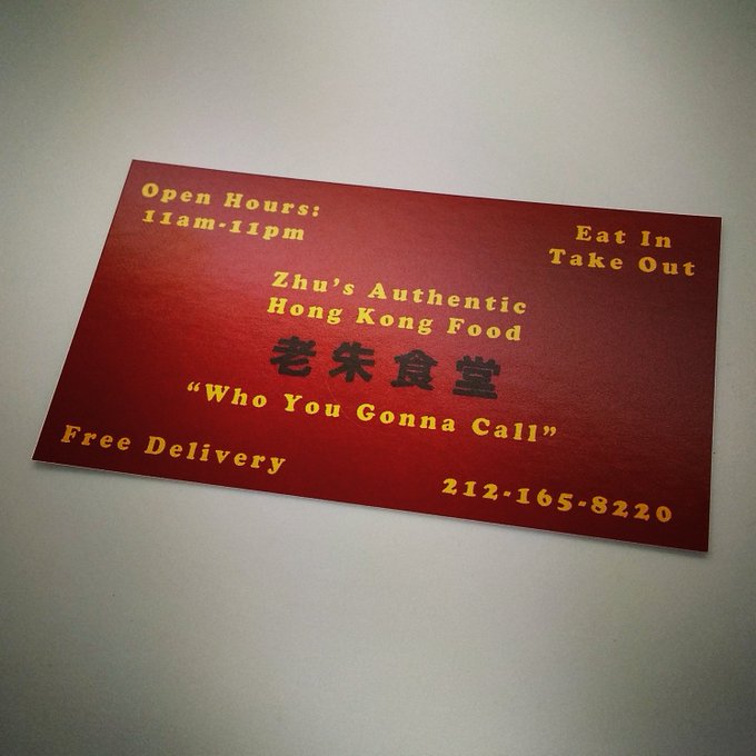
Good start on the card, PT.

Here are some observations from comparing yours to the version included with
Ghosts From Our Past:
* Adding some spaces breaks between the yellow lettering of the text will help bring their spacing to something more like we can see on the original card.
Aside from that, the general spacing and colour choices look pretty close.
Edit: It looks like the
老朱食堂 characters are the exact same font on the card as they are on the 3D signs on the Chinese restaurant location. If that is the case, then this image on Google will be an invaluable source for getting the lock spot-on:
Link


 - By edspengler
 - By Fritz
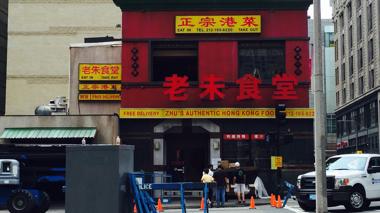